
 By
By 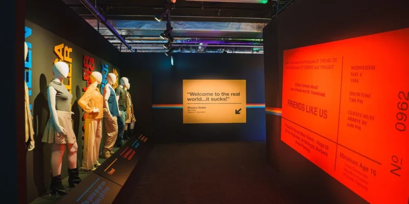
Exhibition spaces often need to communicate information to visitors who are moving through busy environments. Visual elements therefore need to make important messages identifiable without requiring visitors to examine every part of a display closely.
Colour, typography, and graphics perform different functions, but their effects overlap. Their combined use influences hierarchy, readability, brand consistency, and the way information is organised throughout an exhibition space.
How Does Colour Shape Exhibition Spaces?
Colour can distinguish elements and establish relationships between different parts of an exhibition stand. Brand colours may identify the exhibiting organisation, while contrasting colours can separate headings, informational panels, product areas, and directional elements.
Contrast is particularly important for readability. Text and symbols need sufficient visual separation from their backgrounds, while excessive use of competing colours can make it harder to identify which elements deserve attention.
Colour decisions can also be affected by the physical exhibition environment. Lighting conditions, surface finishes, printed materials, and digital displays can influence how colours appear within the completed space.
- Existing brand colour guidelines.
- Contrast between text and backgrounds.
- The number of colours competing within one viewing area.
- Lighting conditions across the stand.
- Consistency between printed, digital, and physical elements.
That said, for expo stand builders, these considerations connect graphic design with the materials and structures used to create the physical stand. Colour therefore functions as both a branding element and a practical method of organising visual information.
How Does Typography Affect Communication in Exhibition Spaces?
Typography determines how written information is presented and prioritised. Exhibition visitors may encounter text at long, medium, and close viewing distances, so type size and placement need to correspond with the intended viewing conditions.
A clear typographic hierarchy can separate different levels of information. For example, a brand name or primary message may receive greater prominence than supporting explanations or product details.
| Typography element | Typical purpose |
| Large display text | Brand names and primary messages |
| Medium-sized headings | Product categories and stand sections |
| Smaller body text | Supporting or detailed information |
| Directional text | Navigation and wayfinding |
Legibility also depends on factors such as typeface characteristics, spacing, contrast, and background complexity. Decorative typefaces can have a role in branding, but important information still needs to remain easy to distinguish.
A sign maker may also need to account for the physical production method. Letter dimensions, mounting position, illumination, material, and available sign area can affect how typography performs once installed.
Overall, typography provides structure to written communication and helps visitors determine which information to read first.
What Role Do Graphics Play in Exhibition Spaces?
Graphics provide another way to communicate information quickly. Photographs, illustrations, diagrams, icons, patterns, and branded imagery can explain concepts or establish context without requiring lengthy blocks of text.
Their function varies depending on placement and scale. Large graphics may be intended for recognition from across an exhibition hall, while smaller diagrams or product images may provide information to visitors already inside the stand.
Effective exhibition graphics generally require consideration of:
- Viewing distance and image scale.
- Image resolution at the required production size.
- Available wall, panel, or display dimensions.
- Relationships between images and accompanying text.
- Visibility around furniture, structures, and other displays.
- Consistency with the wider visual identity.
Graphics should also support rather than obscure essential information. When images, patterns, text, and signage compete within the same area, the resulting visual hierarchy can become less clear.
Graphics therefore provide context and visual information, while typography supplies written detail and colour helps organise both.
Why Should Colour, Typography, and Graphics Work Together?
Colour, typography, and graphics are most useful when they operate within the same visual system. A stand can use colour to distinguish information levels, typography to structure messages, and graphics to reinforce or explain those messages.
Consistency also helps connect different parts of an exhibition space. Repeating the same colour rules, type hierarchy, and graphic style can make product zones, information points, and signage appear related.
Coordination is particularly relevant when several specialists contribute to a stand. Expo stand builders, graphic designers, and a sign maker may work with different materials and production requirements, but the final elements still need to function as one visual environment.
The objective is not simply to increase the number of visual elements. It is to establish a clear hierarchy in which visitors can recognise the brand, identify important messages, navigate the space, and access more detailed information where required.
FAQs
Why is colour important in exhibition stand design?
Colour can reinforce brand identity, distinguish areas, create contrast, and establish hierarchy. Its effectiveness also depends on lighting, surrounding colours, and the materials on which it appears.
How does typography affect exhibition signage?
Typography affects legibility and information hierarchy. Type size, spacing, contrast, placement, and viewing distance all influence how easily visitors can read exhibition signage.
What types of graphics are commonly used in exhibition spaces?
Exhibition graphics can include photographs, illustrations, diagrams, icons, patterns, logos, and product imagery. Their format and scale depend on the information being communicated and the intended viewing distance.
How can exhibition stands avoid visual clutter?
Limiting competing colours, maintaining a consistent typographic hierarchy, and giving graphics defined purposes can reduce unnecessary visual competition. Adequate spacing between elements can also make information easier to distinguish.
Why should signage and exhibition graphics be planned together?
Coordinated planning helps maintain consistent colours, typography, scale, and messaging across the space. It can also help ensure that signage remains visible within the physical stand layout.
Contact Sui Generis Neon and let us create a clear and consistent exhibition space for your brand.




Comments